Sunday, June 30, 2013

A Review of the Hero 59 Fountain Pen

First Impressions (9)
I think that first impressions play a huge role in the decision factor, when it comes to inexpensive pens, especially inexpensive Chinese pens. The (often true) stereotype says that the pen is probably going to perform equivalent to its cost. Yet that first impression may still drive someone to purchase such a pen. Certainly, there may be other reasons involved (there usually are for me). My first impression was what drove me to choose this pen: “Wow, for a Hero pen, that looks really good!”


Appearance (8)
Typically, I am a pretty big fan of Hero pens, and their appearances are in general one of the reasons for that liking. In the case of this pen, it moved away from the generally “simplistic-yet-classy” style of most Hero pens, instead implementing a gold trim to accompany a green marbled look. While the marbling is somewhat flat-looking, when inspected closely (due to the pattern being printed), it is not overdone, is accented nicely by the gold, and does not carry a “cheap” look.


Design/Size/Weight (9)
The design of the Hero 59 is relatively straightforward. There are no surprises. The cap is a simple snap-on, and the clip is springy with decent flex. The grip is molded plastic with a (thankfully) low step-up to the barrel. Overall, the pen is relatively thin, coming close in over-all width to a disposable ballpoint. The rear end of the pen does bear an interesting feature. The plastic is such that it looks, as though it has an end cap that steps down from the barrel, slightly, but this piece is not removable. However, it does serve as a half-decent place to post the cap, holding the cap, there, though not tightly.

The Hero 59’s weight is decent. Capped, I realize that the cap itself contains most of the weight. The rest of the pen only has the slightest heft to it. With my fingers on the grip, the 59 is just long enough to sit comfortably in my hand. The barrel and section screw together smoothly and tightly.


Nib (7)
Surprisingly, this inexpensive nib has a touch of flex to it, which was very unexpected. Aside from that, there is very little that surprises me about this nib. It is a bit rough with mediocre looks. 6/10, but I will give it an extra point for the flex.

Filling System (7)
Typically, I give aerometric filling systems a low rating, because they can be difficult to use, even harder to clean, and generally problematic. In fact, the heavy use of the aerometric filling system is one of the greatest downfalls of Hero brand pens in my opinion. However, this aerometric system has a bonus point of usefulness. The aerometric mechanism is removable, which facilitates much easier and more thorough cleaning.

Cost and Value (8)
At a retail price of $7 US, I would initially be inclined to say that this pen is at the high end of an acceptable price range, considering overall quality at first. However, it certainly matches the quality (if not exceeds) of many “school pens.” Perhaps it is worth that amount, if the pen matches the desires of the future user.


Conclusion (8)
As an inexpensive pen, the Hero 59 is a great option, especially for those looking to avoid the Parker 21-like look of some of the more famous Hero-brand offerings. The slight flex, marbling, and comfortable feel were all really positive aspects of this pen!


Saturday, June 29, 2013

Yet Another Writing Sample (YAWS) - Miniature Broad Edge Lettering

In testing out a Pendleton Point "Good Guy" nib grind, I found it had the fantastic ability of containing just enough italic edge to letter some broad edge. Enjoy this writing sample, demonstrating such. The larger letters were done with a Staedtler calligraphy pen with a B nib. Note that this was written on a Rhodia dot pad (which should provide a sense of scale with the dots).


This scan was done on an HP Deskjet F4280 at 600dpi.
Note: Because these scans are done with a light emitting printer, actual colors will, more likely than not, be slightly darker than they may appear, here. The colors shown, here, are probably a bit more reminiscent of what the ink would be like under a bright light or if it were held up and viewed with a light behind it.

Thursday, June 27, 2013

Stained Fingers on Thursday - A Review of J. Herbin Éclat de Saphir Ink

I am happy to have finally found the opportunity to review this much-touted ink, here on my blog! I must say that the one issue into which I ran was finding a bit of "gunk" at the bottom of my sample vial. However, I was assured that this has the potential to happen only on account of the fact that the ink is more "natural" than chemical in composition. After discarding that congealment, there were no further issues.


This scan was done on an HP Deskjet F4280 at 600dpi.
Note: Because these scans are done with a light emitting printer, actual colors will, more likely than not, be slightly darker than they may appear, here. The colors shown, here, are probably a bit more reminiscent of what the ink would be like under a bright light or if it were held up and viewed with a light behind it.

Tuesday, June 25, 2013

Tea Review Tuesday - A Review of Adagio Teas' Gunpowder Green Tea

A Review of Adagio Teas' Gunpowder Green Tea

Gunpowder is one of my personal favorites, for green tea. However I have only ever purchased it from one or two sources, so I was excited to be able to try it from a company whose gunpowder I had not tried before. Gunpowder is a simple green tea, but sometimes the differences between the same tea from different companies can be quite noticeable.

The dry leaves hold the intense grassiness I have come to associate with most gunpowder greens. After steeping this tea and straining off the leaves, I notice that the steeped leaves have a very dark, almost smoky scent, and I worry that I’ve accidentally heated the water too hot and scalded them. One whiff of the prepared tea banishes that negative thought from my mind, as I am greeted by rolling vegetal tones with a touch of sweet grassiness.
 

These same aromas swell in the flavor of this tea, and the grassy sweetness permeates all taste buds. The smokiness of this tea is stronger than other gunpowder greens that I have tried, and it is a good addition, in my opinion.
 

I give this tea a 77 out of 100 on my personal enjoyment scale.


Adagio's Gunpowder is available from the Adagio website, here.
Photo credit to Adagio Teas.
This review was unsolicited and uncompensated.

Thursday, June 20, 2013

Stained Fingers on Thursday - A Review of De Atramentis Wood Ink

And now...for something different in the realm of inks! My relationship with brown inks is very love/hate, hit/miss, but this color did nothing to help foster positive feelings toward brown inks. In addition to my comments from the review sheet, this ink is supposed to be scented (like "wood"), but I found the "wood" scent to be light, barely present, and relatively disappointing.


This scan was done on an HP Deskjet F4280 at 600dpi.
Note: Because these scans are done with a light emitting printer, actual colors will, more likely than not, be slightly darker than they may appear, here. The colors shown, here, are probably a bit more reminiscent of what the ink would be like under a bright light or if it were held up and viewed with a light behind it.

Tuesday, June 18, 2013

Tea Review Tuesday - A Review of Kalahari Tea's Safari Lullaby Rooibos

A Review of Kalahari Tea's Safari Lullaby Rooibos


As the single package I received contained no instructions for brewing, nor were there any immediately available on the webpage for this specific tea, I chose to utilize typical rooibos steeping for this tea: 1 cup of just-boiled water with a steeping time of five minutes. This tea came in a individually-wrapped tea bag, which really did not have much scent while dry. However, from the second I poured the steaming water over the tea, I could smell the delicious mixture of chamomile and spearmint wafting up from my cup.

The smell of the freshly-brewed, bright red liquor was dominantly spearmint. The rooibos could be smelled a bit in the undertones. Nevertheless, the spearmint was not overwhelmingly strong, which was pleasing. It was just a mild, delicious aroma.

Even after steeping for five minutes, the taste of my first sip did not strike me as being very strong, yet it was quite full. Whereas the spearmint dominated the smell, chamomile dominated the flavor, spreading throughout the mouth quite excellently. The aftertaste was a mixture of primarily spearmint with hints of rooibos lurking in the background.

Overall, this was an enjoyable tea, but not something I would be quick to buy again were I shopping for tea.


I no longer know of a source for this tea.
This review was unsolicited and uncompensated.

Saturday, June 15, 2013

Yet Another Writing Sample (YAWS) - Lots of Handwritings!

Today, rather than provide you with a writing sample that I created, I wanted to share this fabulous article from the FPGeeks website with you. It showcases a fabulous letter, written by someone with the ability to imitate any handwriting. How cool...and intense...is that? Enjoy!
(Warning: the letter contains some language that may be offensive.)

Thursday, June 13, 2013

Stained Fingers on Thursday - A Review of Noodler's Red-black Ink

Hello, hello! This is going to be one of those ink posts, where I primarily let the review sheet do the talking. As you can see, there is a lot about which to talk, but let us not talk about why I chose the colors that I did for comparisons...

On a related note, some very nice blue ink samples just arrived. I cannot wait to share them with all of you!


This scan was done on an HP Deskjet F4280 at 600dpi.
Note: Because these scans are done with a light emitting printer, actual colors will, more likely than not, be slightly darker than they may appear, here. The colors shown, here, are probably a bit more reminiscent of what the ink would be like under a bright light or if it were held up and viewed with a light behind it.

Wednesday, June 12, 2013

A Review of the Baoer 388 Fountain Pen


First Impressions (7)
Normally, the combination of gold and silver (even just a silver color) is not something of which I am a fan, yet this pen has something striking about it.


Appearance (8)
Gold accents highlight brushed silver. If there were no engravings on the pen, I would term it one of the most nondescript fountain pens that I have ever seen. Yet, even in its nondescript fashion, it maintains an air of elegance. The engravings of the “Baoer” brand and “388” model number draw the eye to the cap, where the gold cap band is joined by a decidedly Parker-looking, arrow shaped clip, topped with a black cap jewel. Removing the cap, the gold accents continue, interrupted by a black, plastic grip, which actually appears quality. (My past experiences with black plastic grips on Chinese pens have been less than desirable.) Possibly the most impressive aspect is that it appears the gold plating on the two-tone nib is actually done well, keeping with the engraving lines.


Design/Size/Weight (6)
As I have found with other Baoer pens, the weight is nice and balanced. It is not very heavy, but there is enough heft to let one know that it is there and avoid feeling like a feather in the hand. Unfortunately, the cap is made so that it is quite a bit too tight, taking some effort to pull off and snap back on the pen.


Nib (8)
This relatively nice looking nib holds some interesting surprises! Other Baoer nibs, both fine and medium, have provided smooth operation and pleasant experience. This one is no different ...in those regards. Beginning to write with it, I exert a bit of pressure and suddenly - flex! The flexing is not large, yet it is unique and unexpected.


Filling System (7)
The Baoer 388 takes both long and short standard international cartridges, and it comes with a converter. Sadly, it seems that not all Baoer converters carry a good quality, as this one is less than well made, having a cheap feel and a rough turning mechanism. However, this deficiency does not render it unusable nor does it affect the pen’s functionality.

Cost and Value (9)
I would say that this Baoer is an excellent pen for the cost, writing quite nicely straight from the package. It has a few points that could be improved, but at such a low price point these could easily be overlooked.


Conclusion (7.5)
In conclusion, I think that Baoer has crafted another good quality pen that is easily affordable for fountain pen users with all budgets. Its semi-elegant looks would make this pen a great gift for writers from the high school class room to the corporate world.

Please feel free to post questions or comments!
This post was neither compensated nor solicited.

Tuesday, June 11, 2013

Tea Review Tuesday - A Review of The Simple Leaf's Shanti Green Tea

A Review of The Simple Leaf's Shanti Green Tea


I had not had a green tea in a long time and thought that this might be a pleasant change in my normal drinking habits. The first thing with which I was struck was the balance of sweetness and grassiness in the dry leaves. They had the vegetal aroma of gunpowder green tea mixed with a sharp sweetness that did not overwhelm, but rather blended well.

I was surprised to find that this green tea comes from India, specifically Arunachal Pradesh. Having never tried any green tea from India before, I figured I was in for a treat.
The aroma of the brewed tea matches the dry leaves perfectly with an excellent balance of vegetal and sweet. My first sip is surprising, as the cup is really quite bold. Right when the taste is almost too much on the vegetal side, it lapses into soft sweetness, before I even swallow. A pleasant surprise indeed, as most teas this bold are merely full of grassiness and vegetal flavours.
The cup continues to develop, leaving me with slightly smoky aftertastes, yet smooth finishes throughout.

As I sip my way through the cup, I enjoy this tea more and more. It has complexities in the aroma and flavour that put it a step above other greens that I have tried. I would definitely recommend giving this tea a try. I rate it a 75 out of 100 on my personal enjoyment scale.


The Simple Leaf is no longer in business, and I do not believe this tea is available any more.
Photo credit to The Simple Leaf.
This review was unsolicited and uncompensated.

Sunday, June 9, 2013

The Grand TWSBI Review - Part 3. A Review of the TWSBI Diamond 540 Fountain Pen

Welcome back to the Grand TWSBI Review! If this is your first time reading part of this series, I  recommend that you read the introductory post as well as the review of the TWSBI Diamond 530. However, prior reading of those posts is not necessary - welcome to the review of the TWSBI Diamond 540 fountain pen...read on!


First Impressions (8)
My first impressions of the 540... “Hmm, okay... What changed?” I was of course referring to the fact that the TWSBI Diamond 530 and 540 are almost cosmetically identical. To my eye, nothing has changed; we will get to the actual changes, shortly. The 540 still carries an initially intriguing factor.


Appearance (8)
I ended up trying the amber-colored Diamond 540 of which I was initially very uncertain, regarding the color. Over time, it has grown on me, or perhaps I have merely become accustomed to its look. Strangely, the amber even seems to go with the silver accents, fairly well. (On the other hand, gold accents would have blended too much, and TWSBI does/did not have gold accents on the Diamond 540.) The pen lines are clean, and the diamond panels on the barrel are subtle in a good way. The amber is not my favorite of the three colors (the other two being smoke and sapphire), but it is a unique color option.


Design/Size/Weight (10)
There are two primary differences between the TWSBI Diamond 540 and its predecessor, the 530. Foremost between these is the increased ink capacity to 30% more than what the 530 could hold, which is a relatively substantial number, when speaking in terms of milliliters. Secondly, TWSBI has improved the ease with which the cap screws on the body (the improvement was to the threads). While I never noticed a significant issue with the 530 (cap), testing the two pens, side-by-side, certainly proves a different feel.

The Diamond 540 has a light to moderate heft and is by no means heavy. Posting the cap leads to a very back-heavy feel, but the intention was not to make the cap postable. Still present on the 540 are the nib-shielding cap insert, the o-ring to help seal the cap, and the special “no mess” filling system, wherein the entire section may easily be removed to allow for filling from the TWSBI Diamond 50 and Diamond 50P inkwells.

The Diamond 50 still carries the stigma of having been reported time and time again to crack. I have not had this issue, while testing the 540, but it is known, and TWSBI promises a fix in the next Diamond series incarnation, the 580. Thus, my rating stands at an actual 9.75/10, as the pen is improved over the 530 but still receives quite a few reports of the cracking.


Nib (10)
In looking back at my review of the Diamond 530, specifically the nib, I noticed that I rated the nib a 10/10. However, there are two main differences between that nib and this one. First, that nib was a medium, and this one is a fine. The fine has quite a bit of feedback - just a touch more than I feel a fine nib should have. Unfortunately, on some papers, this “tooth” leads to a bit of a dragging feeling, rather than a glide. The second difference, which may or may not be related to the first, is that I believe the 530s had Schmidt-brand nibs, while the nibs of the 540 are made by Bock. Rating the nib a 9.5 actual on account of the over-feedback. Width-wise, I would say it is comparable to a Lamy fine nib.


Filling System (10)
Just as with the Diamond 530, the 540 has a great piston filling system, and I could not detect a noticeable difference in the smoothness of operation. For cleaning, everything disassembles nicely with the included tool, and the built-in system for filling from the Diamond 50 or Diamond 50P inkwell works great.


Cost and Value (10)
As I mentioned in my review of the Diamond 530, the Diamond 540 is now out of production, having been replaced by the Diamond 580. That being said, TWSBI still “supports” the 540, and they are very helpful, when it comes to replacing a cracked section, etc. If you find one of these still for sale, I highly recommend making the purchase, as it is a great value and worth the investment.


Conclusion (9)
(9.21/10 actual score)
I think what brought the score of the 540 down for me, as compared to the 530, was the color. If I had been testing the sapphire (or maybe even the smoke) 540, I think it would have easily been a 10/10 overall. That said, if you like the amber color, great! Overall, as I mentioned in my review of the 530: If you can find one of these, buy one. If you would rather get a new pen, buy a Diamond 580. I personally believe that the TWSBI Diamond series make for great, reliable writing instruments for the new user or fountain pen veterans.


Have you tried the Diamond 540 and the Diamond 530? What do you think of one versus the other? How do you feel about the limited color options?


Feel free to post any questions or comments you might have!
This post was both unsolicited and uncompensated.

Saturday, June 8, 2013

Have you been missing Lego?

I have great news for those of you, who have been missing the Lego content on this blog! Several new Lego books are going to be released over the coming weeks and months, and I fully plan to review them all and share the (hopefully) excellent content with all of you! Additionally, a trip to my local Lego store has been planned (for a special project), and there are one or two other special projects on the horizon for the near future. Stay tuned for all of the above and more!

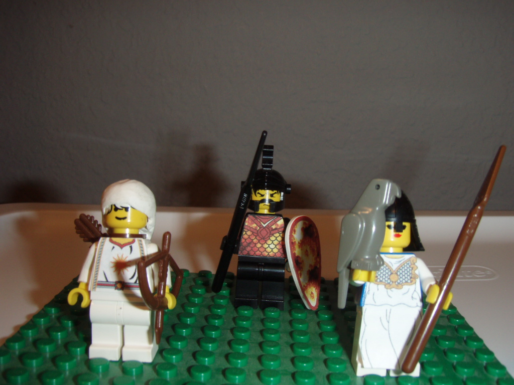
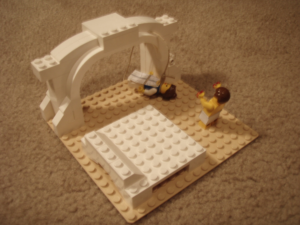
In the meantime, I present to you some custom figures that I created quite some time ago (nine years, perhaps):

Apollo, Ares, and Minerva from "The Iliad"


A scene from "Oedipus Rex" by Sophocles
 
Photo credit to me (Spencer).

Yet Another Writing Sample (YAWS) - Broad Edge Tengwar Calligraphy

Earlier this week, I promised a unique post for today's YAWS, and here it is! Drawing from the post, two weeks ago, on broad-edge lettering (and my attempts thereof) and the post from last weekend on a transcription of Tolkien poetry in Tengwar, the alphabet of Tolkien's elves, I present to you: broad-edge lettering applied to the Tengwar alphabet.


A bit of nerdy background... Tolkien's two primary elven languages are Quenya and Sindarin. While they both use the same alphabet, the Tengwar, each uses it in a slightly different way, or "mode." Notice the curls, lines, and dots above what appear to be the main letters? Those "additions" represent vowels, and the large letters represent consonants. The primary difference between using Tengwar to write Quenya and using it to write Sindarin is whether vowels are placed over the letter that they follow or the letter that they precede. Here, the words "arandur" and "tengwar" are both written using the Quenya mode, which maintains the vowels being placed above the letter that they follow.

The first word, "arandur," happens to be the Quenya word for "steward," which is a translation of the name "Spencer!" Thus, the name "Spencer" in Quenya is "Arandur."

I hope you enjoyed this post!

Thursday, June 6, 2013

Stained Fingers on Thursday - A Review of Noodler's Golden Brown Ink

For a while, I had a sort of "fling" with brown ink. Brown ink was the most fascinating thing ever, and I acquired several samples of various browns. After a while, the fascination waned, but this brown by Noodler's remained in a pen that traveled around in my on-the-go pen case. In thin nib strokes, it holds consistently, and its shading is a lot of fun. Definitely lighter than an ink like Montblanc Toffee Brown but still very usable in daily writing.


2013-10-29 EDIT: Updated with an additional pen.

This scan was done on an HP Deskjet F4280 at 600dpi.
Note: Because these scans are done with a light emitting printer, actual colors will, more likely than not, be slightly darker than they may appear, here. The colors shown, here, are probably a bit more reminiscent of what the ink would be like under a bright light or if it were held up and viewed with a light behind it.

Tuesday, June 4, 2013

Tea Review Tuesday - A Review of TeaFrog's Vanilla Rooibos

A Review of TeaFrog's Vanilla Rooibos

 Hmm, the scent of this dry rooibos is legit. And by legit, I mean it legitimately smells like vanilla. Not fake vanilla like is used in various desserts, but real vanilla. Adding three teaspoons of this tea and steeping it in two cups of water for six minutes, I was left being tantalized by the aromas of vanilla wafting from my teapot as I waited. The tea smells sweet, but not in a fake sweetener way. It is more like the sweetness that comes from plants like mint or various fruits. The liquor is clear, yet a very dark red-brown.

My first cup smells warm. And not just from the hot tea. It just has a warm, and soft, aroma about it. It softly caresses the senses and lingers in the nose. Eagerly, I take my first sip and am immediately surprised by how sweet it tastes. The sweetness is very passive, but it is definitely there, and a quite pleasant surprise. This tea's mouthfeel is thick and smooth. The flavor of vanilla is, of course, at the forefront. The rooibos, sadly, seems to have taken a backseat in this brew, as it does not show its head much, except in the aftertaste.

The flavors do not change much throughout the rest of the pot. I very much enjoyed drinking this tea. It is good, it is unique, and it is well worth a taste or two. I give it a 77/100 on my personal enjoyment scale.


TeaFrog's Vanilla Rooibos can be purchase from the TeaFrog website, here.

This review was unsolicited and uncompensated.

Monday, June 3, 2013

Exciting New Content - European Paper, TWSBI, and YAWS

Hello to all of you - there is some exciting new content coming to Built from Ink and Tea. With our recent acceptance to European Paper's affiliate program, we hope to be bringing you reviews of some fantastic products. Be sure to visit their site, which you can visit by clicking the picture, below.

Additionally, the next installment in the Grand TWSBI Review will be arriving soon. Watch for it!

This next Saturday's YAWS is shaping up to be a unique posting, too. Enjoy!


Saturday, June 1, 2013

Yet Another Writing Sample (YAWS) - Tengwar Tales

I would like to think that, if Tolkien's elves had access to fountain pens, they would use them exclusively, though dip pens might be more realistic, given their time period.
This writing sample is actually from several years ago, and it was something that I found, while working on a writing sample, which will go live next Saturday!
(For any Tolkien linguists in my reader base, I would like to disclaim that there may be errors in transcription!


The Tale of Gil-Galad
Gil-galad was an Elven-king.
Of him the harpers sadly sing:
the last whose realm was fair and free
between the Mountains and the Sea.

His sword was long, his lance was keen,
his shining helm afar was seen;
the countless stars of heaven's field
were mirrored in his silver shield.

But long ago he rode away,
and where he dwelleth none can say;
for into darkness fell his star
in Mordor where the shadows are.


Pen: Speedball C-5
Ink: Winsor & Newton Crimson